Bauhaus

Geometric rigour and clean shapes inspired by the Bauhaus movement to structure the visual identity.


Modernising the image of industry
01 / OVERVIEW
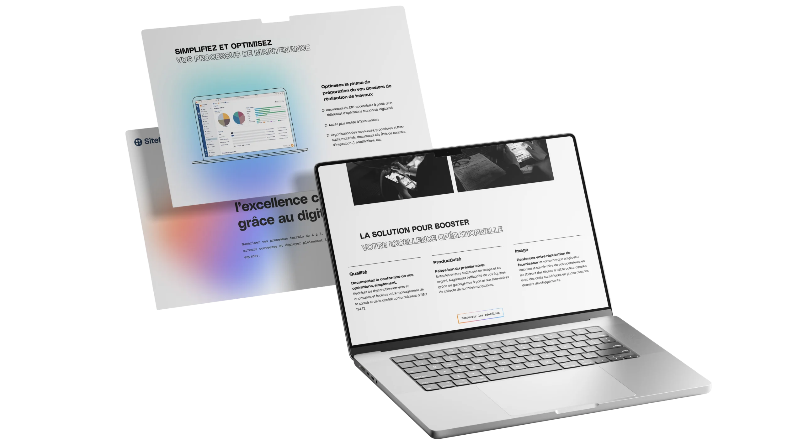
Siteflow is the first cloud software for optimising and managing nuclear operations. The goal was to rebuild Siteflow’s entire visual identity, drawing on the Bauhaus, industrial blueprints and a bright, neon colour palette, while keeping the existing logo and typeface.
02 / THE CHALLENGE
Siteflow needed an in-depth visual overhaul to stand out in the nuclear sector. The logo and typeface had only recently been changed and had to stay. The challenge was therefore to rethink everything else in the visual identity.
The inspiration was to come from three worlds:
the Bauhaus for geometric rigour, industrial blueprints for technical authenticity, and bright colours to bring energy and modernity to a traditionally conservative sector. Everything had to work across a HubSpot website and PowerPoint templates.
03 / BRAND STRATEGY
Geometric rigour and clean shapes inspired by the Bauhaus movement to structure the visual identity.

The look of technical and industrial drawings as a common thread, evoking the precision of the nuclear sector.

A vibrant palette to energise the brand and break with the nuclear industry’s traditional codes.

An identity designed for digital, from the HubSpot website to social media and presentations.
04 / LOGO
The logomark and wordmark must never be used without each other, except in special cases such as branded merchandise.

05 / COLOUR PALETTE
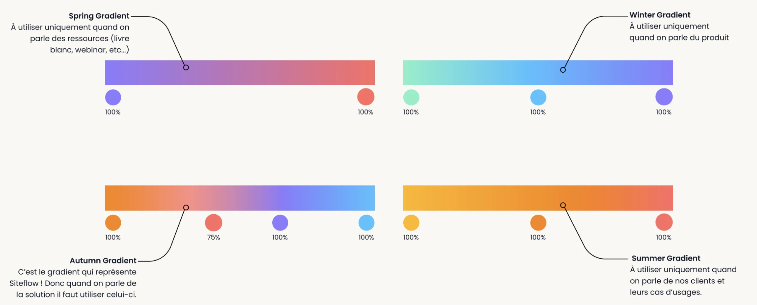
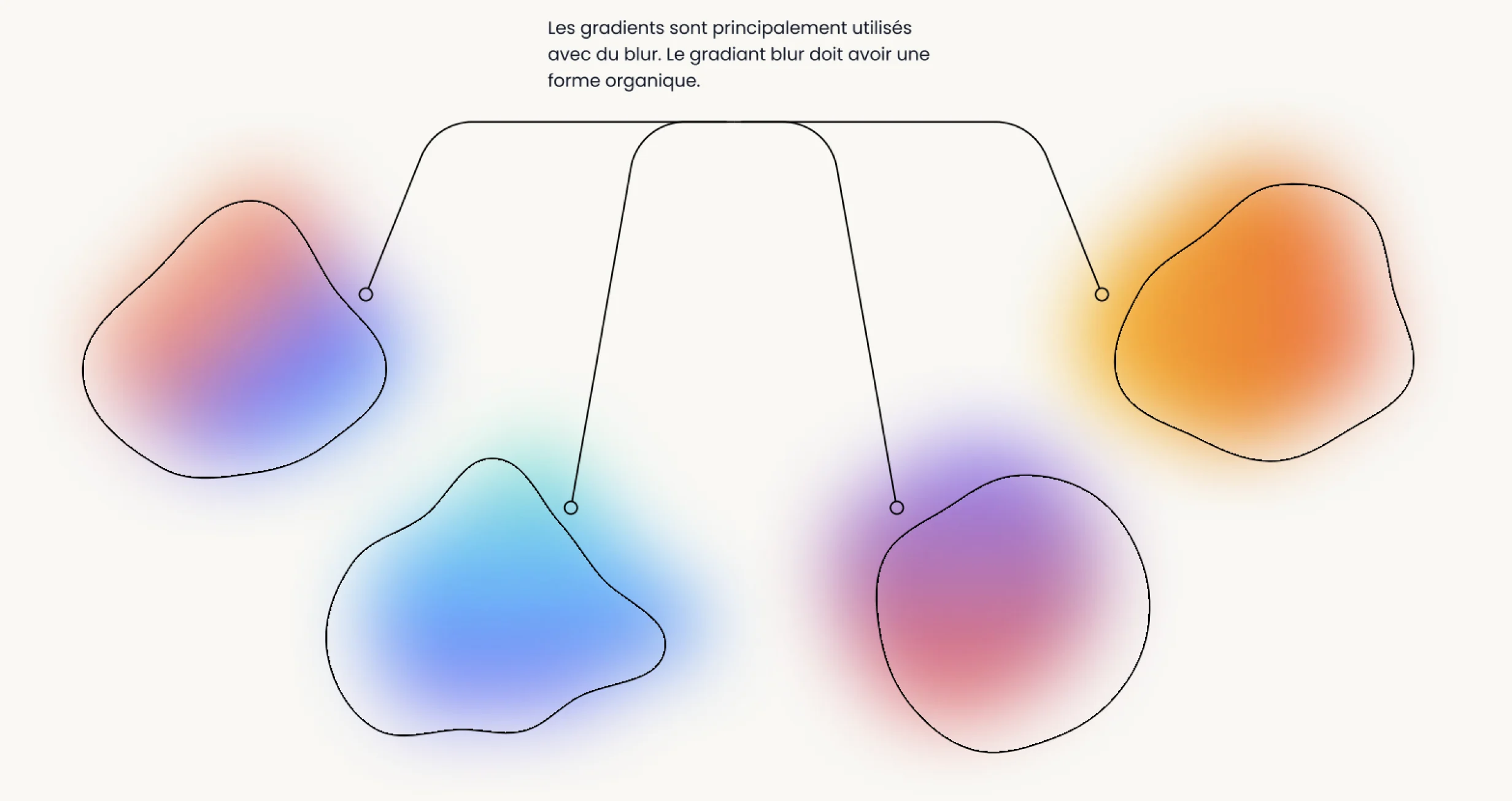
This range of colours covers every medium and use. The primary colours form the base palette for all documents and presentations. The secondary colours add occasional accents, used sparingly. The four gradients highlight text, images or illustrations, each with a specific purpose.
Dark Blue
#133050
Bittersweet
#FF6B64
Black
#000000
Paper
#F9F8F5
#7EF0C8
#219EBC
#4BC1FF
#8C78FF
#E28FCE
#FB8500
#FFB703
06 / TYPOGRAPHY
Headlines
Poly Sans (Bulky & Wide)

Use PolySans for all headlines. Chosen for its modern feel, a perfect match for Siteflow’s DNA of innovation and digital transformation.
Body & Legend
Poppins (Regular, Bold, Italic)
Poppins
Aa Bb Cc Dd Ee Ff Gg Hh Ii Jj Kk Ll Mm Nn Oo Pp Qq Rr Ss Tt Uu Vv Ww Xx Yy Zz
For body text, use Poppins, a typeface made for the web, available on “Google Fonts”.
07 / Iconography
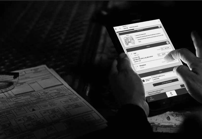
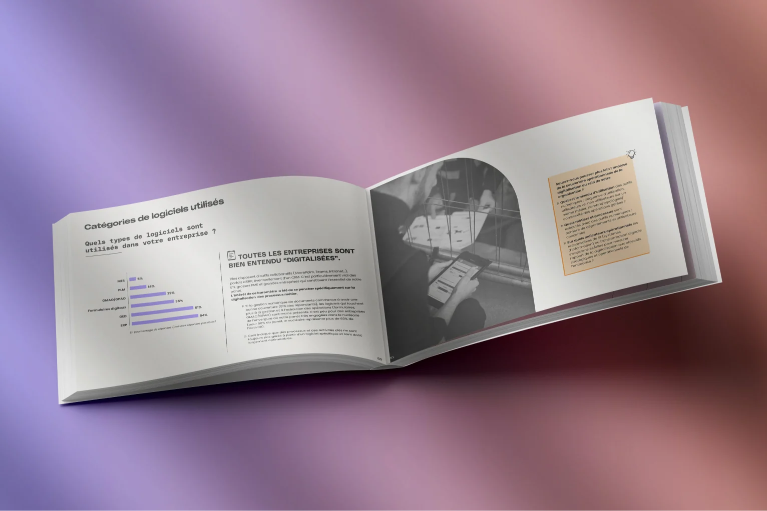
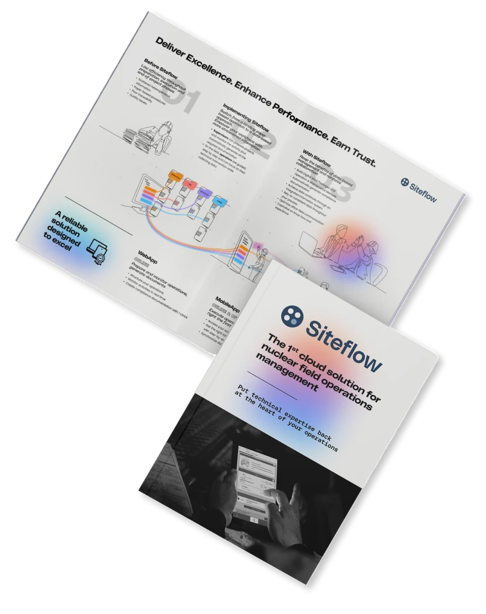
Photos are black and white to keep a raw, industrial feel. Illustrations are all drawn in a single line, in the spirit of a blueprint.




08 / DELIVERABLES
09 / CONSTRAINTS & BRIEF
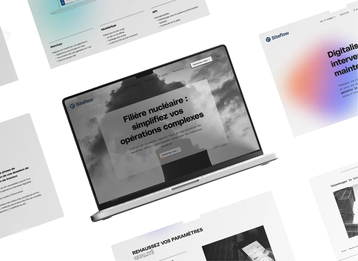
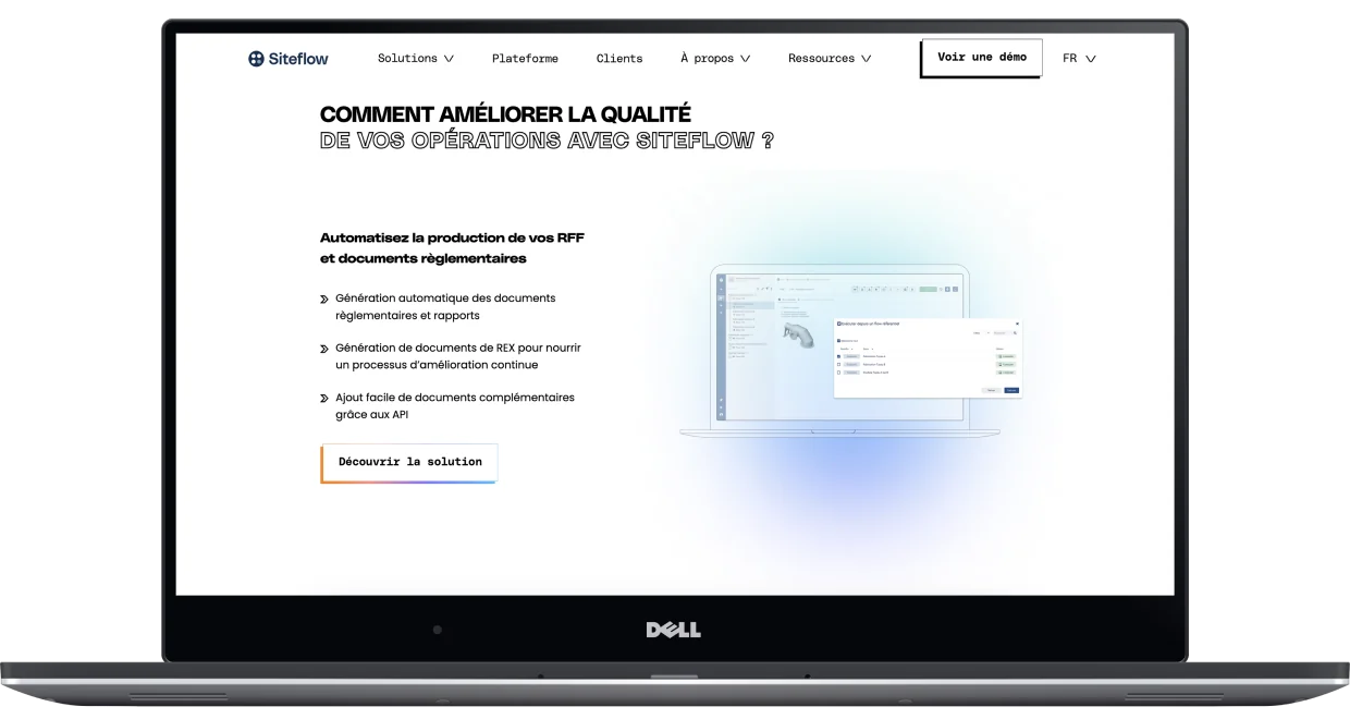
The website had to be developed and built on the HubSpot CMS platform.
Presentation templates had to be created in PowerPoint for the sales team.
The existing logo and typeface had to be kept, as they had recently been updated.