01
Grow ARR
Offer a high-value feature to grow annual recurring revenue.
Target KPI
Recurring revenue growth


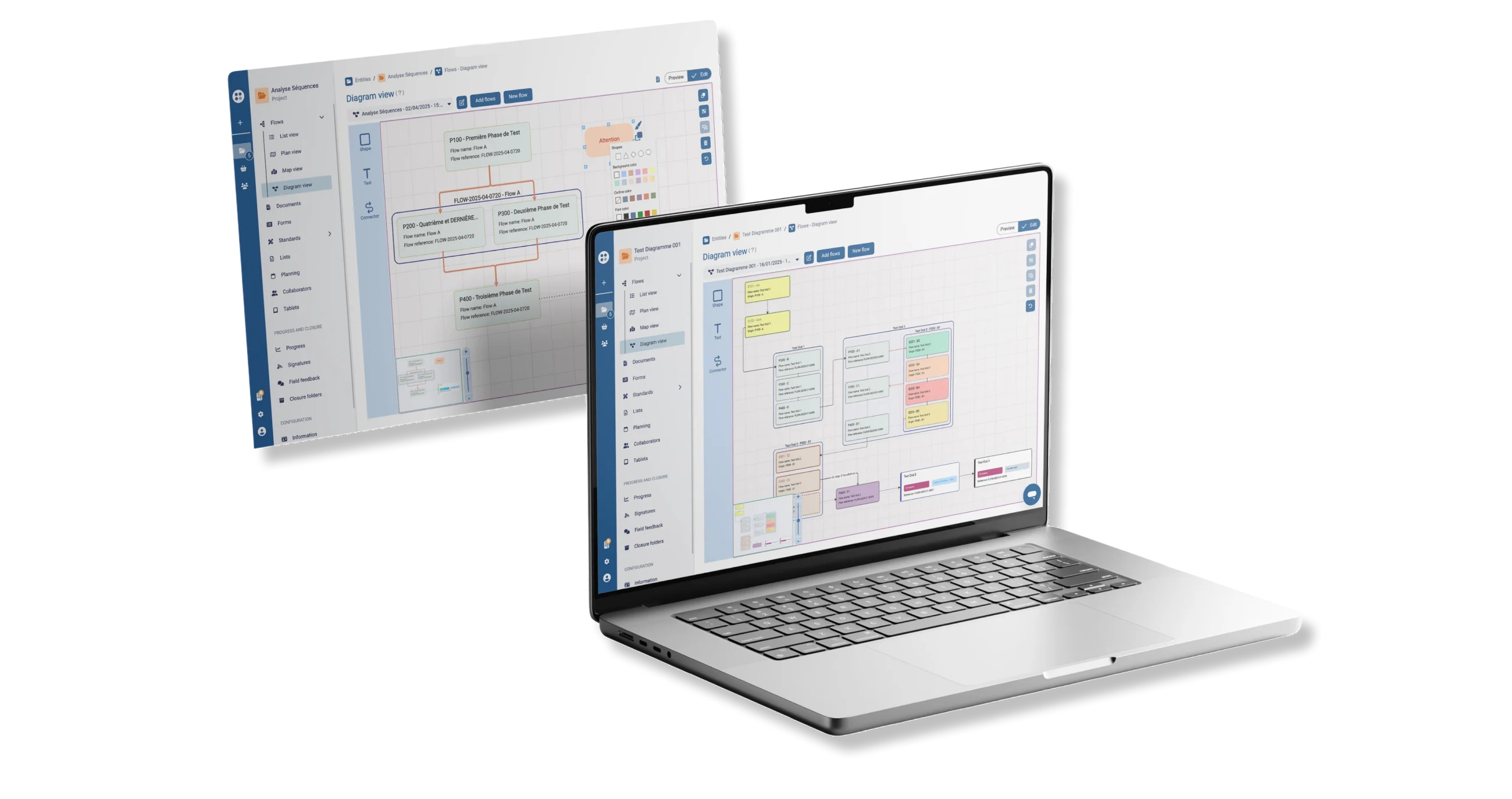
Integrating an interactive diagram tool into the Siteflow platform
01 / THE PROBLEM
Siteflow users map out their field operations as flowcharts in Visio (Microsoft software). They wanted a similar whiteboard built right into Siteflow, so they could import the flows they create and bring them into an interactive diagram.
This fragmented workflow creates a lack of visibility, leading to errors in the field and wasted time. Users have to switch back and forth between the flow view and the diagram view, or build an overview outside Siteflow.
7 out of 8: Drag & drop confusion
Testers instinctively clicked to add an element instead of using drag & drop during user testing.
02 / GOALS
01
Offer a high-value feature to grow annual recurring revenue.
Target KPI
Recurring revenue growth
02
Improve the user experience by building diagram tools directly into the platform.
Target KPI
Less switching between tools
03
Provide a clear, intuitive interface for creating and editing diagrams.
Target KPI
Intuitive navigation validated by testing
03 / RESEARCH & USER TESTING
We ran user tests to choose the better of two navigation designs. 8 participants interacted with one of the two prototypes.

Comparative tests on two navigation prototypes

Single navigation vs. split navigation

7 out of 8 testers instinctively clicked instead of using drag & drop to add an element to the workspace.

6 out of 8 testers preferred the interface with creation buttons separated from action icons, for greater clarity.

Half of the testers struggled to tell apart the duplicate, group and ungroup icons in the toolbar.
04 / PERSONA

Methods Planner
Industry • Methods lead • Uses Visio daily
“I want to organise my operations and see the links and dependencies between them directly in Siteflow, without going through an external tool.”
Goals
Pain points

Field Project Manager
Construction • Coordinator • Manages several teams
“I need to edit my flow and phase cards right in the diagram, without switching back and forth between views.”
Goals
Pain points
05 / USER FLOW
To reduce friction, we designed a direct flow that lets users create and edit their diagram while seamlessly bringing in Siteflow elements.
Step 1
Create a diagram
New diagram view
Step 2
Add elements
Drag & drop from the sidebar
Step 3
Edit the cards
Change text, colours and shapes
Step 4
Group elements
Organise into named groups
Step 5
Connect the flows
Add links and dependencies
06 / WIREFRAMES & ITERATIONS
We experimented with two distinct navigation frameworks to identify the most intuitive interface for creating diagrams.
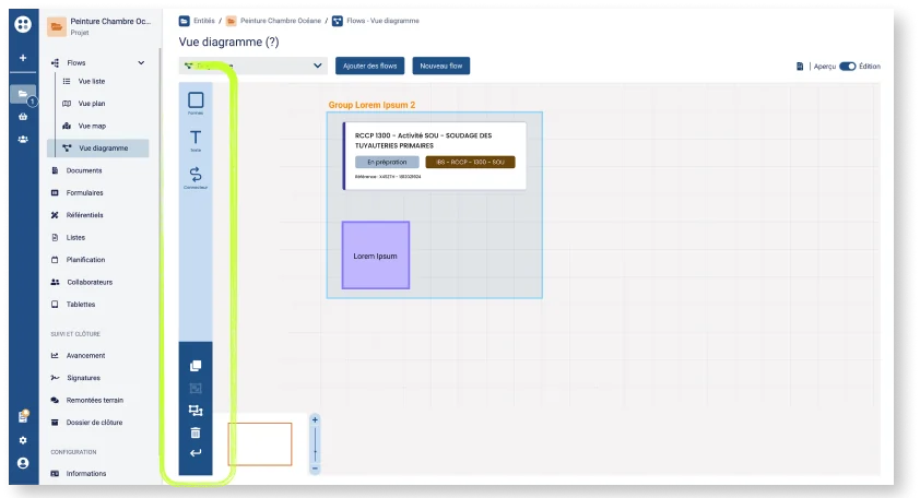
v1 – Single navigation
All actions (creating and editing) in a single bar. Testers asked for the icons right next to the elements they were editing.
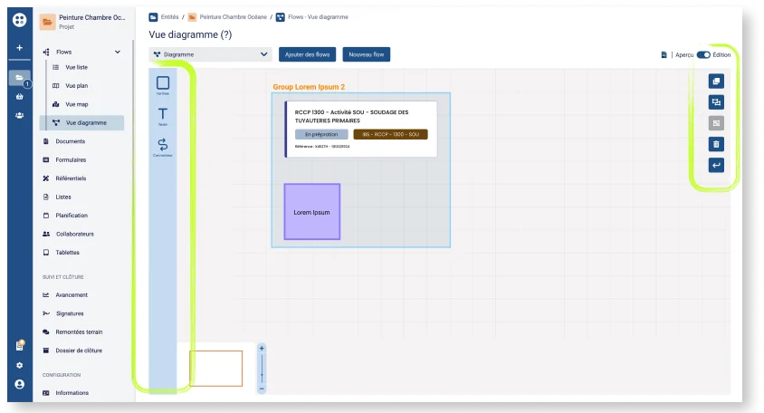
v2 – Split navigation
Creation buttons on one side, action icons on the other. Easier to read, with different kinds of actions visually separated.
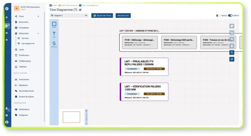
Final Choice – Split navigation
6 out of 8 testers preferred this version. Separating creation and editing actions makes the interface clearer and more intuitive.
07 / FINAL UI
A clear, intuitive interface designed to fit naturally into methods planners’ existing workflow.
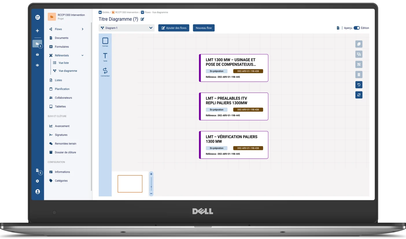
01 / Workspace
Main diagram view with an elements sidebar, an action bar and an interactive canvas.
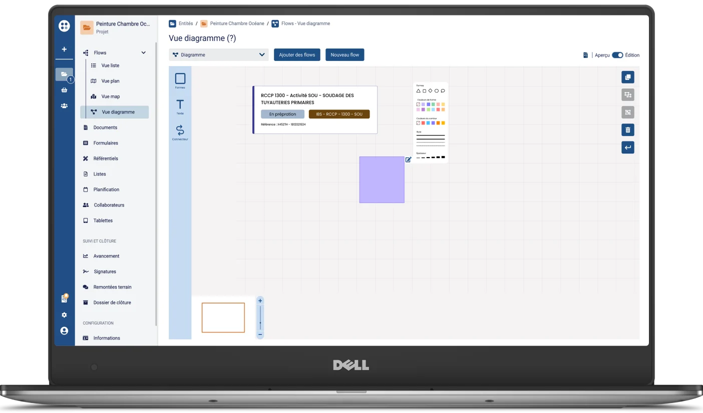
02 / Editing elements
Contextual editing palette to change the colours, outlines and text of diagram shapes.
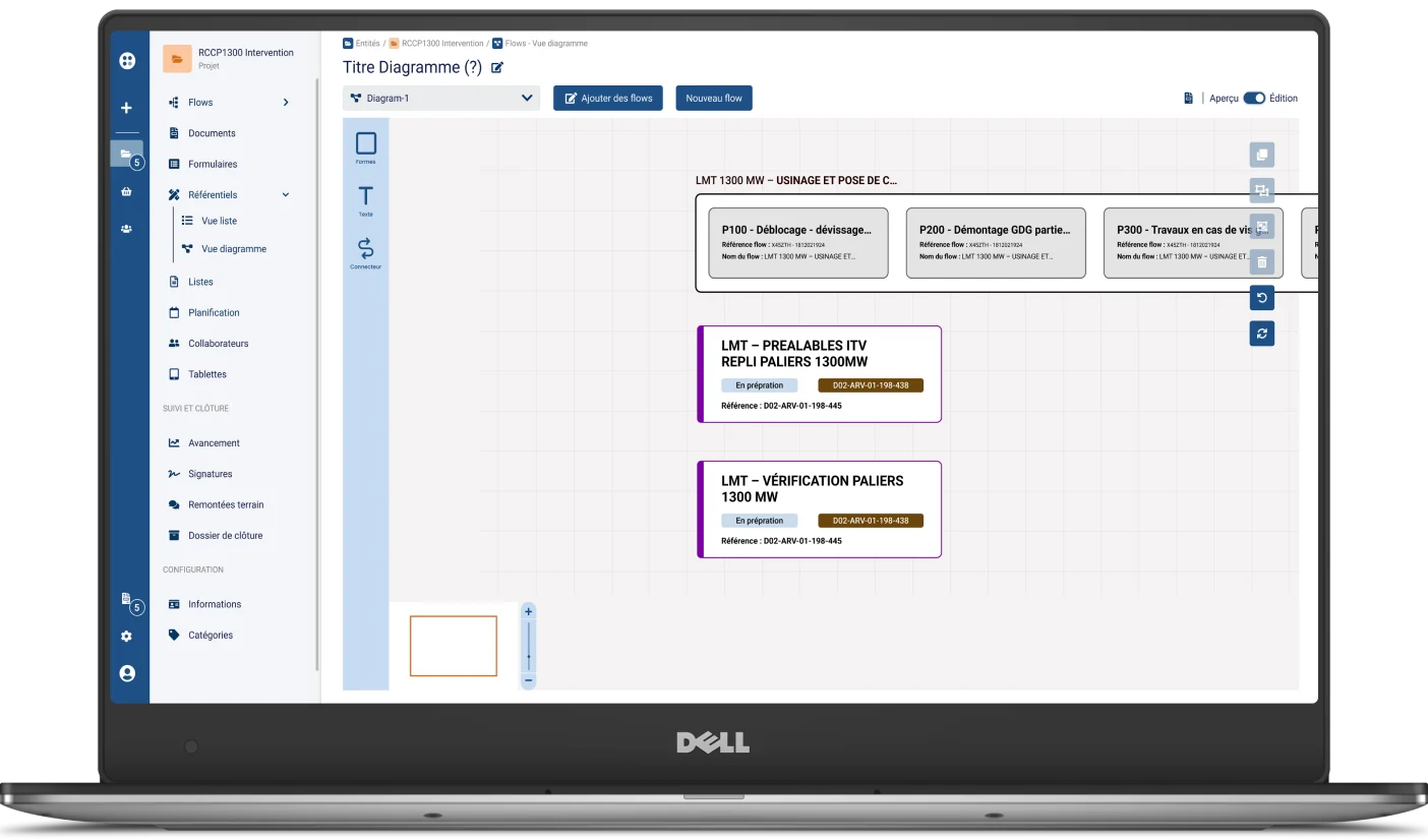
03 / Groups and connections
Elements organised into named groups, with dependency links between flows and phases.
08 / TECHNICAL CONSTRAINT
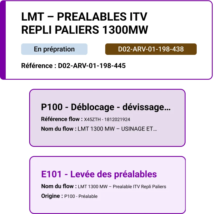
With limited time and resources, we used the GoJS library to build the diagram whiteboard in Siteflow. Some components still needed a custom UI.


09 / RESULTS
6/8
Prefer split navigation
User test result
75%
Success rate
Of tasks completed on the first try
50%
Of testers would like
keyboard shortcuts
10 / LEARNINGS
Testing showed that drag & drop isn’t intuitive for everyone.
Offering alternatives such as click or double-click is essential to keep the interface accessible.
Creating and editing are different kinds of actions.
Separating them visually adds clarity and reduces confusion, as 6 out of 8 testers confirmed.
Having to use the GoJS library required close collaboration with the developers
to adapt the design to what was technically possible while keeping a good UX.
